 Image 1 of 2
 Image 2 of 2
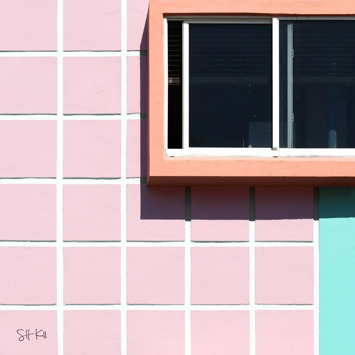
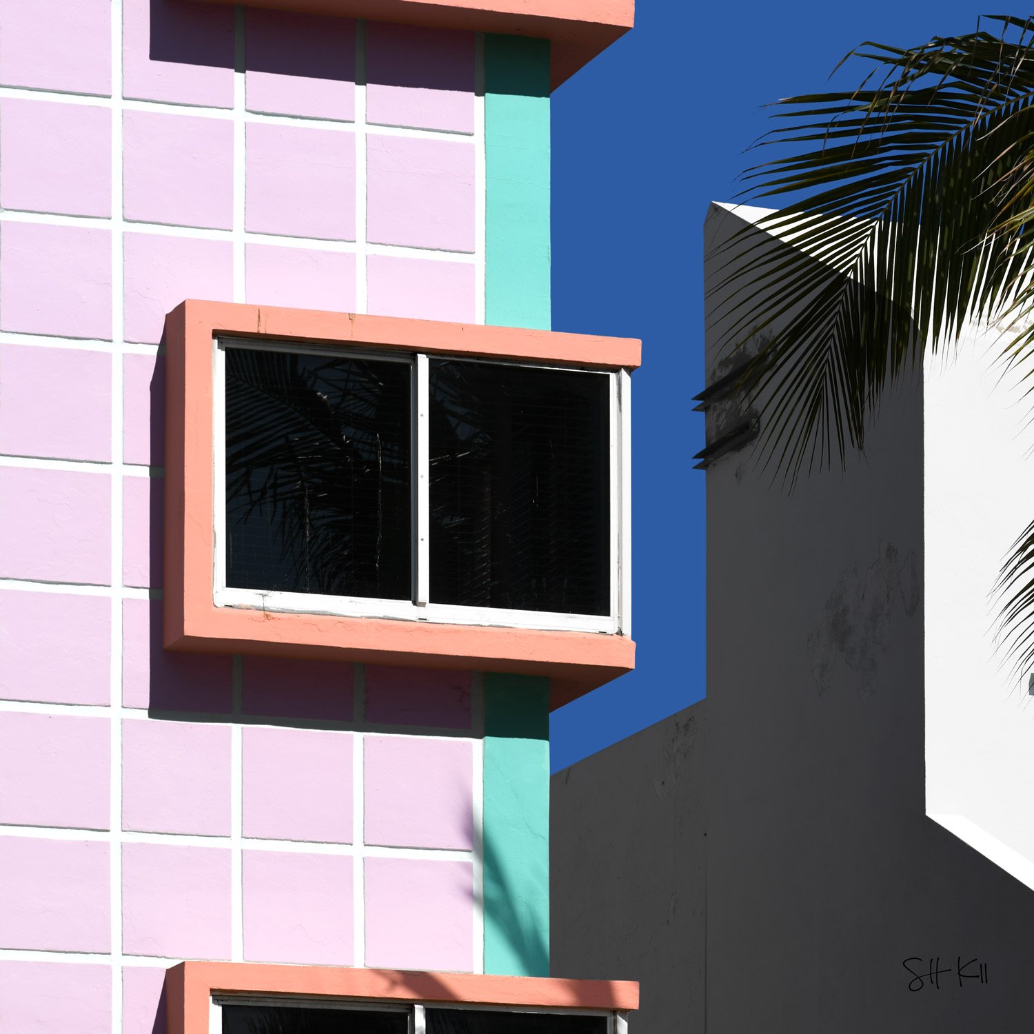
The Leonard Horowitz color system for Miami Beach's Art Deco district wasn't about individual buildings — it was about what happened between them. A lavender facade next to a teal stripe next to a salmon window frame: none of these colors demands attention in isolation, but together they create something that reads unmistakably as a place. Here the full palette is present in a single facade — the pink lavender tile grid, the teal vertical band, the salmon window frame with its small ledge below. In the window glass, a palm tree reflects back at the building, the tropical landscape claiming a piece of the architecture's surface. On the right, a grey neighboring building provides the contrast the Horowitz palette was designed against. The color exists partly in relation to what the district used to look like, and might have remained.
🖼️ Need help finding a gallery wall frame for your prints? We’ve put together a list of gallery wall frames available for each of our frame sizes.
🚚 Curious about delivery times? Reference our worldwide delivery time blog post.