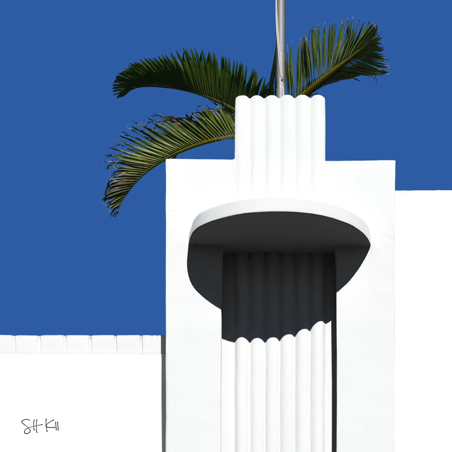
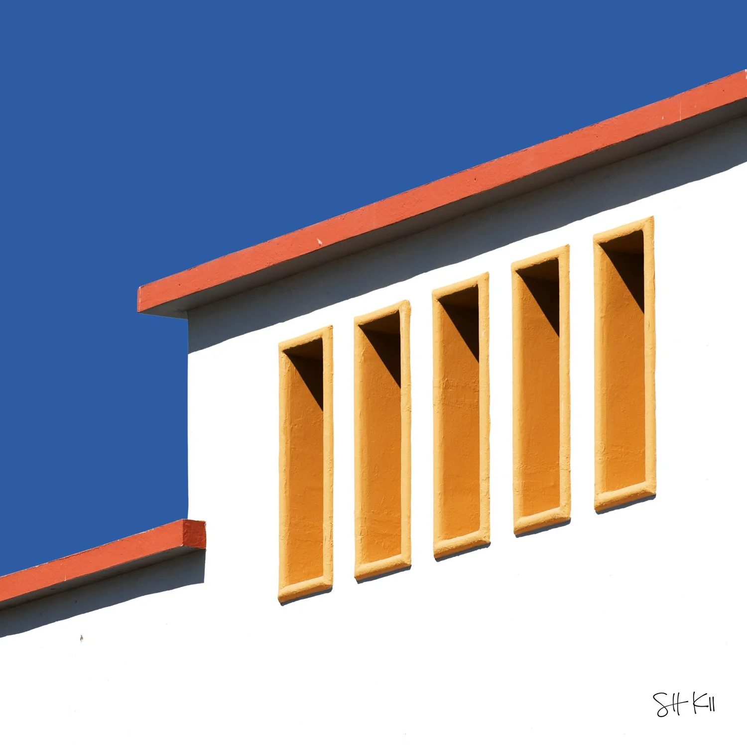
 Image 1 of 2
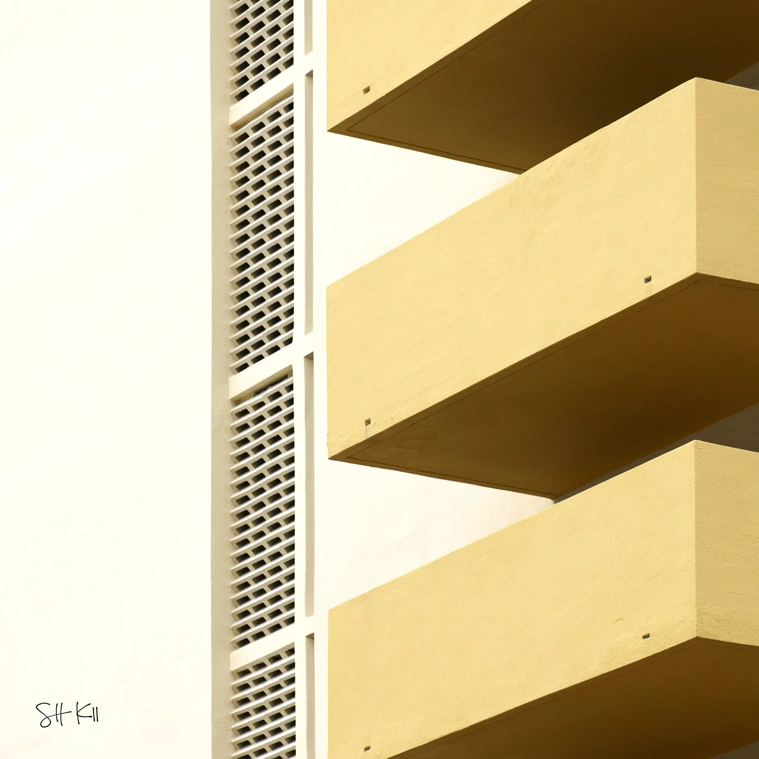
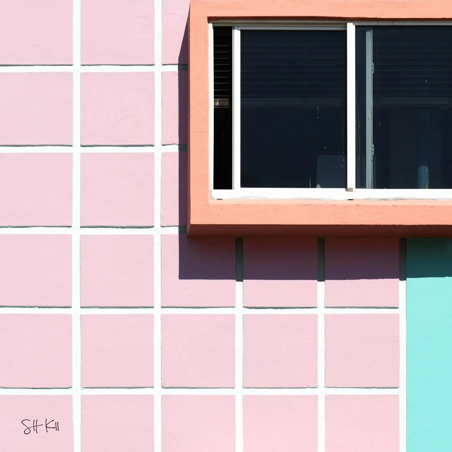
 Image 2 of 2
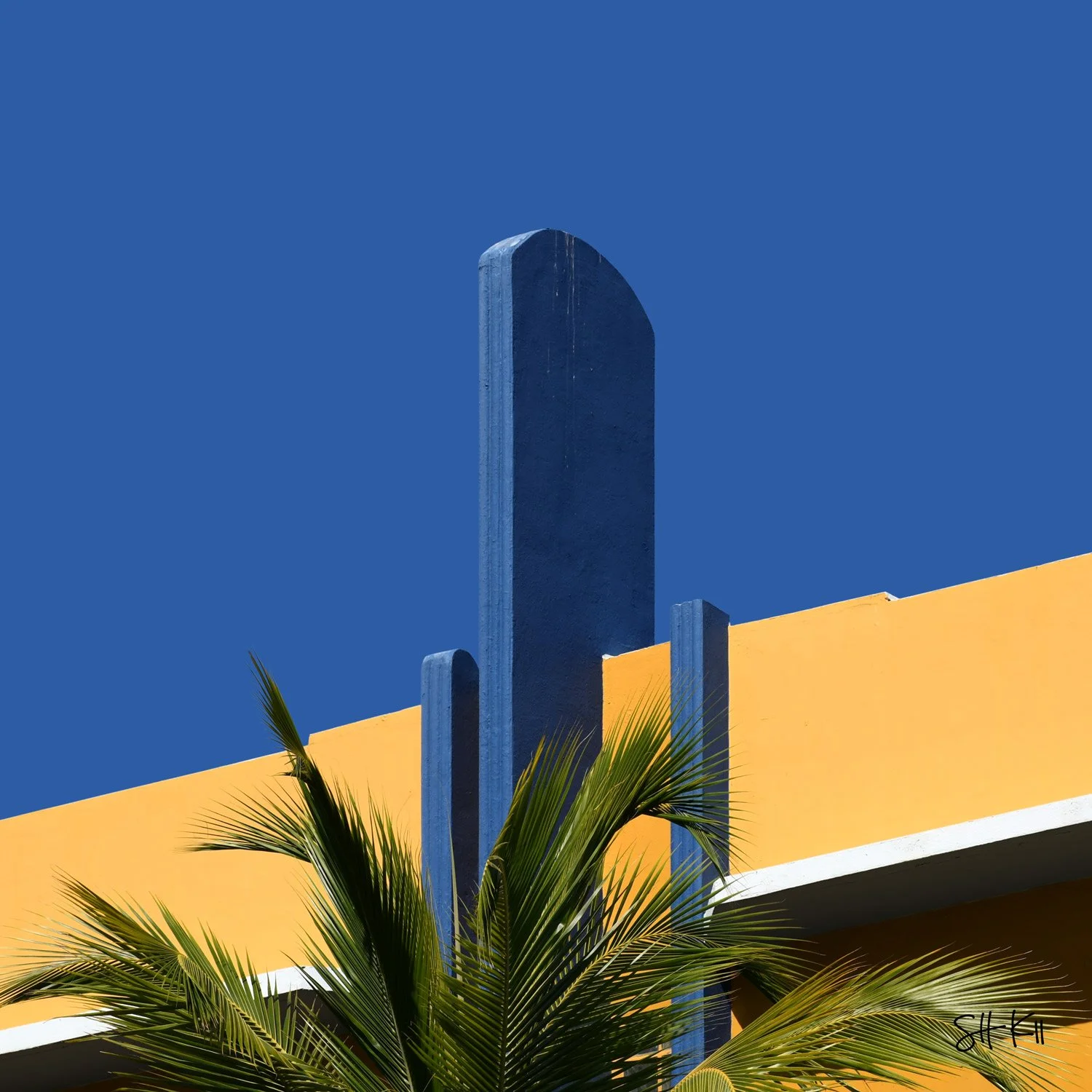
The pastels of Miami Beach are more deliberate than they appear. When the Art Deco preservation movement gained momentum in the 1980s — led by Barbara Baer Capitman and the Miami Design Preservation League — designer Leonard Horowitz developed a specific color palette for the district's buildings to distinguish architectural details and make facades legible in the strong Florida light. Pink, coral, teal, lavender, pale yellow: colors drawn from the subtropical environment and applied systematically to buildings that had previously been plain white. This facade — pink tiles with a coral window surround and a teal section at the lower right — is that palette at its most graphic. Three colors, a tile grid, a window, and a shadow. The district's chromatic argument, made in a single frame.
🖼️ Need help finding a gallery wall frame for your prints? We’ve put together a list of gallery wall frames available for each of our frame sizes.
🚚 Curious about delivery times? Reference our worldwide delivery time blog post.